
My flyer is complete!
I am happy with the way it turned out! I like what it says and my logo.
I’m just not sure about the font. Is it too fancy? I know it doesn’t match my logo on the bottom of the page.
I’m not sure.
I was going to play around with the font after work tonight and try different fonts.
Here it is:
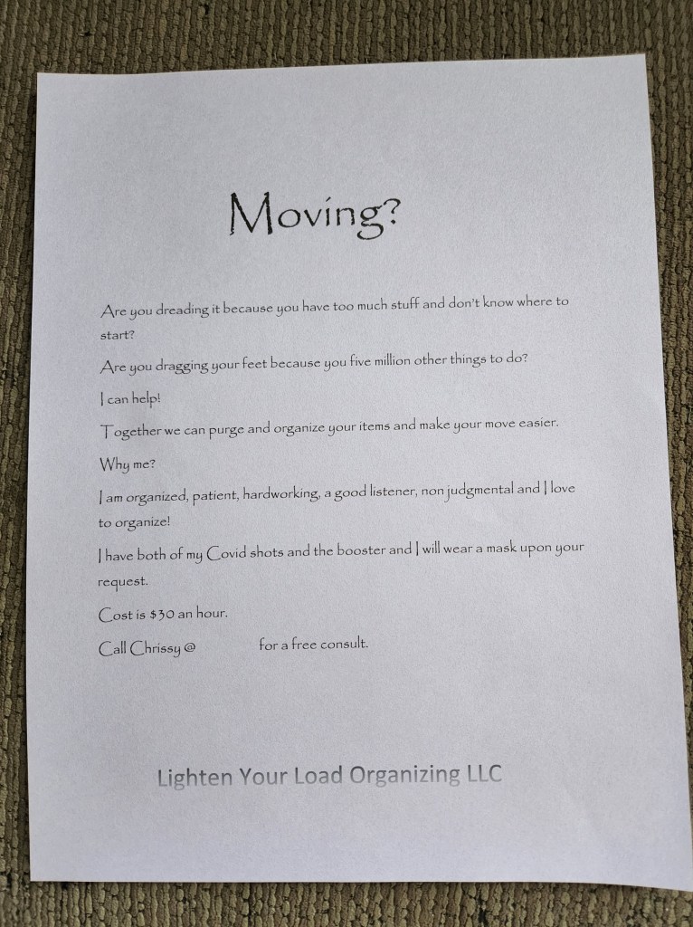

I know it has a couple of typos. I’ll change them later
So what are your thoughts?

Well done!
LikeLiked by 1 person
Thanks. I kinda scary putting yourself out there!
LikeLiked by 1 person
I like it! I’d change the bottom font’s fade-effect, though. (Can you flip it?) It looks like the printer was running out of ink since it’s at the bottom of the page.
LikeLiked by 1 person
Looks good! I would add a few words to sentence #2 — Are you dragging your feet because you HAVE five million other things….. You may also think about centering the copy instead of flush left. But enough of my chattle — I love the font and the message!
LikeLiked by 1 person
Thank! I’ll try centering it. Never thought if that.
LikeLiked by 1 person